The Everest Analyzer is a powerful tool to get a snapshot of the stock’s current situation and its underlying company. It lets investors understand stocks’ weaknesses through the flagging system, pointing out the aspects that need further analysis.
The analysis can be broken down into four sections:
- Stock Name and Ticker, Price, and general information: This section overviews the stock and the underlying company. A complete company overview that describes its business model is also available under the analyzer.
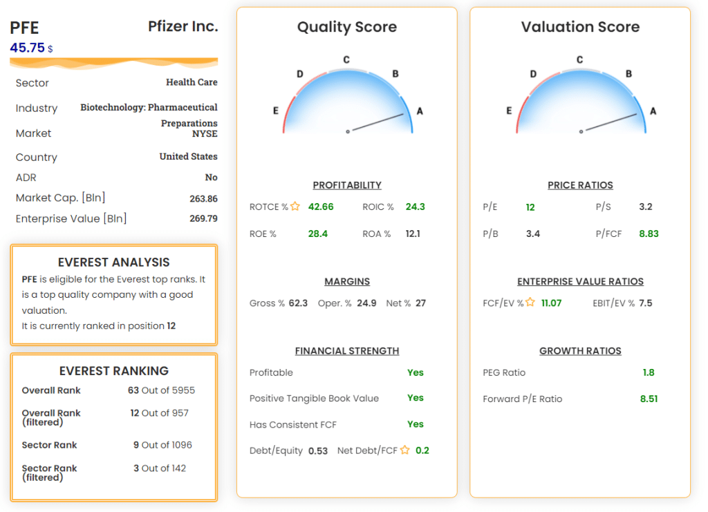
- Everest Analysis widget: The Everest Formula processes the stock through a 4-step validation, and in this widget you find the outcome, which can be:
- Fail on step 1: The stock has not passed the precision filter. More details are given in the reason section.
- Fail on step 2: The stock has not passed the quality filter. More details are given in the reason section.
- Fail on step 3: The stock has not passed the valuation filter. More details are given in the reason section.
- Stock eligible: The stock has passed all the filters and is ranked based on the valuation ranking method. The rank position is given inside the widget.
The Everest Analysis widget helps understand why the stock is discarded (if discarded) by the Everest Formula and dig more into the reasons.
- Everest Ranking widget: This section reveals the company’s ranking position assigned by Everest Formula relative to its sector and the entire US market.
For each rank type, the section shows the ranking filtered by the precision filter, which is the reference ranking of the official Everest Strategy, and the unfiltered ranking (i.e., including ADRs, Finance, Utility and Real Estate companies, and Small Caps).
Unfiltered rankings can be helpful to find good stocks that the Everest Formula has automatically discarded but that we can deepen to understand if it is worth investing in. In addition, sector rankings are helpful to know how the company is positioned relative to competitors and if similar companies are more attractive.
- Quality dashboard: A set of metrics representing the company’s overall quality. The dashboard is composed of 3 sections:
- Profitability: How the company can transform its assets into profits. Each metric gives an answer from a different side.
- Margins: Useful metrics to understand the MOAT of the company and the competitors’ pressure.
- Financial Strength: A look at the company’s balance sheet and the ability of the management to get profits without incurring in heavy debt.
- Valuation dashboard: A set of metrics representing the stock’s valuation. The dashboard is composed of 3 sections:
- Price Ratios: Classic metrics that compare the price of the stock with fundamental aspects of the company’s operations, like revenue (P/S), income (P/E), equity (P/B), and free cash flow (P/FCF).
- Enterprise Value Ratios: Enterprise value, differently from the simple price, takes into account the company’s debt level and can give better indications of the value of a stock.
- Growth Ratios: Valuation metrics that also consider the company’s expected growth. Useful for companies that rely considerably on their growth.
Flagging System: Each metric of the quality and valuation dashboards is valued by general rules that judge a company in that specific metric. Values are colored green, black, or red, indicating a good value, standard value, or poor value for that stock.

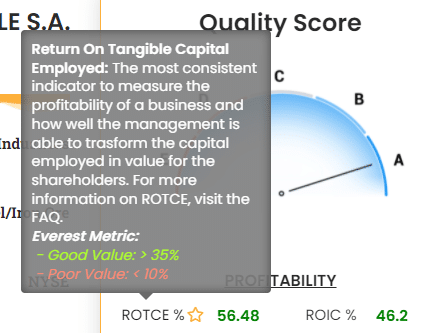
Metric Tooltips: Each metric has an associated tooltip that appears when tapping or hovering on the metric itself. The tooltip shows a complete description of the metric, how it can be helpful, and what are the threshold values that make the metric considered good or poor for the company.
Analysis Examples
We show two examples in which the Everest Analyzer is a powerful tool for identifying weaknesses and pointing investors in the right direction.
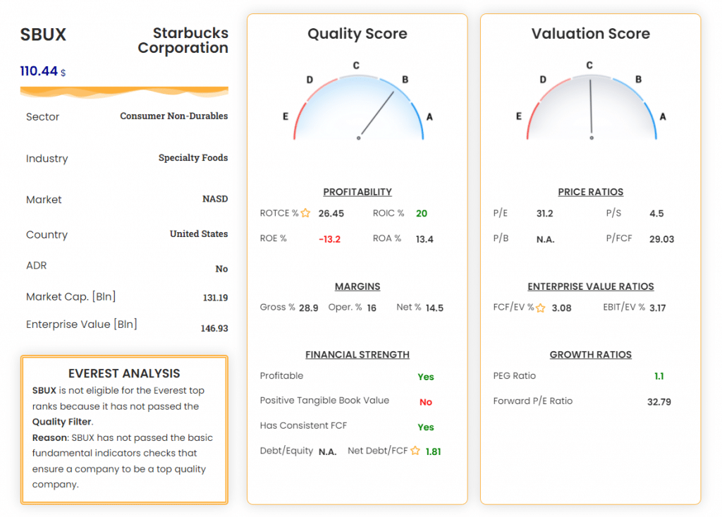
Starbucks Corp. – SBUX: The Everest Analysis highlights possible problems (as an investment) from a quality perspective. Digging into the metrics of the quality dashboard, we notice that Starbucks has good profitability, a big MOAT (indicated by high margins compared to peers in its sector), a contained debt, but negative equity, pointed by the negative ROE and the negative tangible book value.
At this point, the investor should try to find the reason for this anomaly and come across some articles that explain the reason:
“In Starbucks’ case, it appears to be from two in particular. Firstly, the company has a lot of leverage: it has around $37.2bn in total liabilities and only $29.4bn in total assets. Secondly, the company has been paying out more than it has earned. This can be attributed to the company’s generous buybacks and dividends. Despite only earning a total of $9.03bn net income over the 3 years to September 30, 2020, the company has paid out $5.4bn in dividends and spent $19bn buying back company stock in that time. While this has probably pleased many shareholders because it’s resulted in a nearly 100% total return (including dividends) in only 2 years, it is not sustainable in our view.“
This behavior is not good for a long-term investor and should raise a huge red flag.

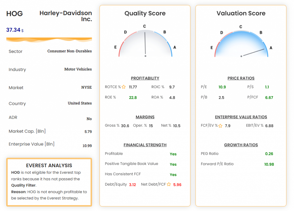
Harley-Davidson Inc. – HOG: Harley-Davidson is an iconic motorcycle brand of the ’80s and ’90s whose stock appears exceptionally cheap for the current valuation. The extremely low price ratios could attract a negligent investor. Here the Everest Analysis shows two crucial aspects: non-optimal profitability (ROTCE and ROA are on the lower threshold) and a remarkable amount of debt. Putting these aspects together with the continuous revenue decrease over the last decade makes HOG stock a high-risk stock that investors should carefully inspect before investing.


